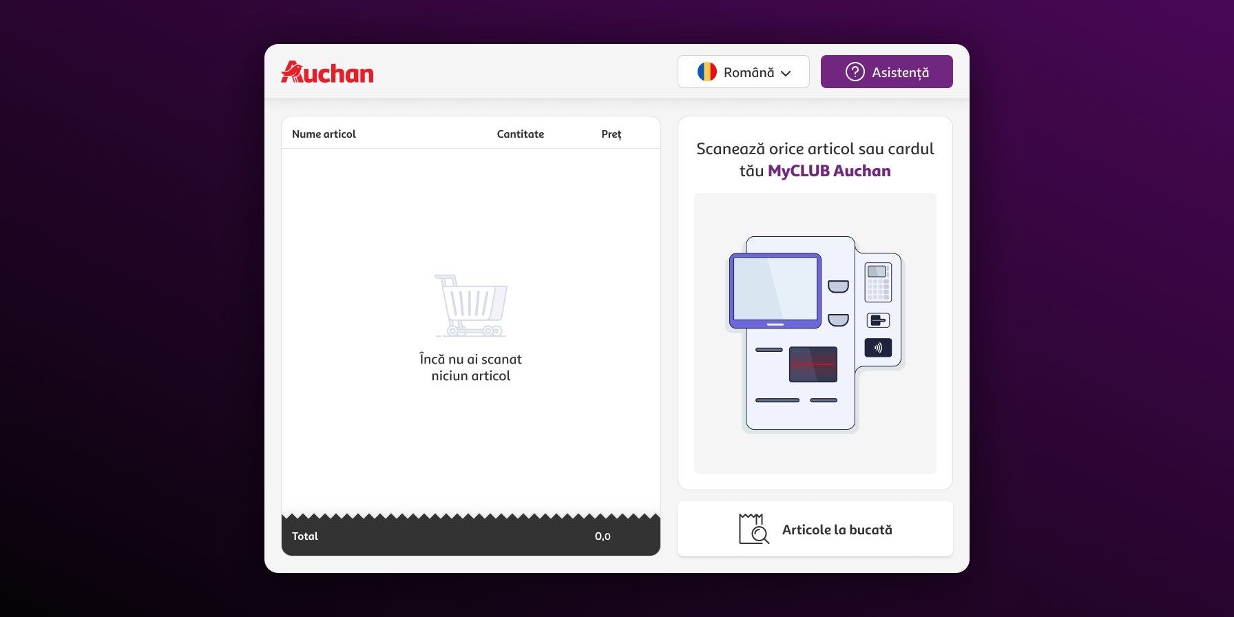


For this case study, the emphasis is more on the process and steps. I’m still working on a nicer way to present the UX artifacts and hi-fi mockups for this project.
Role
Visuals, IxD, High-fidelity prototype (Figma)
Tools
Miro, Figma, Adobe Illustrator
This project was a part of our coursework of the UX Course organized by The Informal School of IT. Each team comprised of 4 students had the challenge to redesign a self-checkout flow for a local retailer.
The first step was gathering the self-checkout flows of 5 retailers (Auchan, Carrefour, Lidl, Cora, and Kaufland). This method helped us discuss and understand better some of the following:
We further discussed and compared these flows so we can understand the main differences between them.
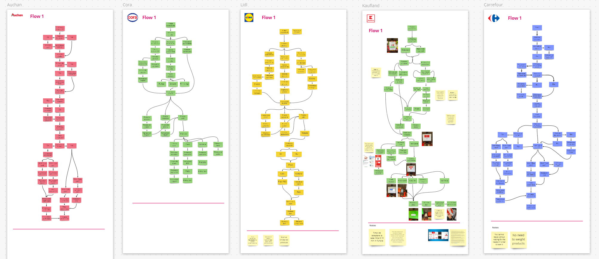
User flows of five retailers (Auchan, Carrefour, Lidl, Cora, and Kaufland)
We gathered various articles about SCO (adoption, UX redesign case studies, accessibility, etc.). We then compiled a list of general insights and problems that were solved in these redesign cases. A significant number of the problems addressed in the studies were also present in Auchan’s flow. This was was the deciding factor to choose this store’s flow to redesign.
The conclusion of our desk research left us with a list of assumptions and hypotheses. These helped us come up with adequate interview questions. Some of these hypotheses are:
We conducted 16 semi-structured interviews. This helped us identify customers’ general attitudes on Auchan’s self-checkout experience.
Since these were semi-structured interviews, there was some freedom left for deviation (within limits). We followed an interview guide but based on the interviewers’ responses, we altered the questions in order to follow relevant ideas as they came up throughout the interview.
The interviewing process took about two weeks. Each session was recorded and lasted approximately 15 minutes. Some of the topics covered in the interviews were:
To generate insights and concepts from the interviews, we performed thematic analysis. For a better understanding, all 16 audio files were transcribed. Each member of the team received a transcript other than one of their own. We took notes and highlighted any vital information from the received transcript. The files were then passed to someone else, obtaining a new set of notes based on the same transcript.
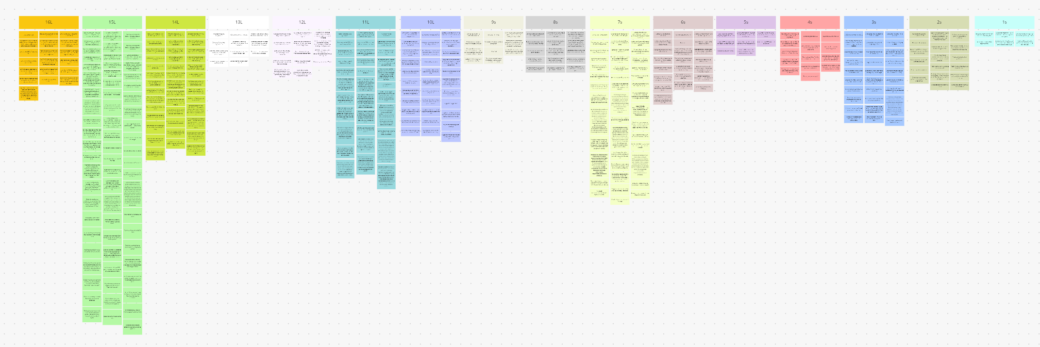
Notes resulting from the thematic analysis, color coded by participant
The large number of interviews offered enough information to create an affinity map in Miro. Each insight was color-coded by participant. This offered a very convenient way to get back to the transcript in case any idea was too ambiguous on its own.
Next, we collected all the similar highlighted segments and created groups on the go. The sorting depended on the insights we found. We formed, reformed, and renamed these groups multiple times until no new ones were found. At the end of this step, we had all the insights assembled by topics and main themes. After that, we extracted the key notions from each group.

Groups resulted from affinity mapping
Overwhelming in-store experience
Some participants described the experience as claustrophobic. They expressed a need to have more space between tills and between the other customers.
Interface difficulties
Participants said that they would prefer a simplified interface and easier-to-follow information. The tills present too many buttons users can interact with. They said that the interface is not designed with a lot of freedom in mind.
Weighing scale
Participants said that the scales have a lot of problems and are very difficult to use. Often putting products on them seems impossible due to a large number of errors. Machines freeze whenever the scanned product has a different weight than its database record.
The insights informed us about the primary user needs and expectations in the context of using self-checkout machines. Based on these insights, we designed a persona and her journey map. This helped us expose the potential gaps in the existing system. Next, we highlighted the redesign opportunities these gaps create.

Persona of Andrea, the target user for our redesign project
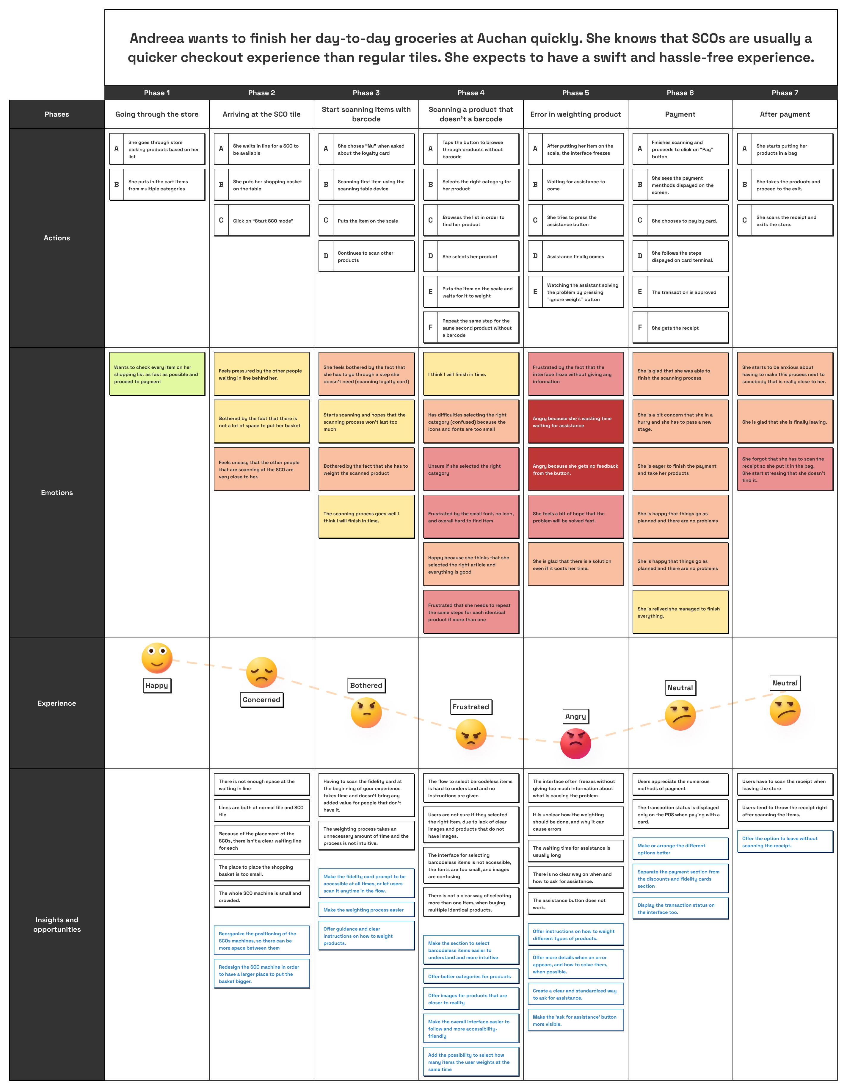
Andreea’s journey map
This was also the last step we did as a team. From here, each of us formulated our own design goals and problems, and we started working on the solution.
Based on the above research insights and the resulting user persona and journey map, I defined the primary design goals to drive the whole design process. These goals kept me focused and helped me rationally take design decisions.
🚀 Faster experience and ease of use
The redesigned interface should be faster and easier for first-time users and customers accustomed to SCO machines.
🌐 Freedom of use
The redesigned interface should give more freedom to the customers throughout the checkout journey without constantly relying on assistance on edge cases.
💡 Learnable
The redesigned interface should give first-time users the chance to use it without assuming they have any prior experience using SCO machines.
❌ Better error handling
The redesigned interface should handle errors less frustratingly.
Multiple versions of navigation methods and structure rearrangements were sketched throughout the process.
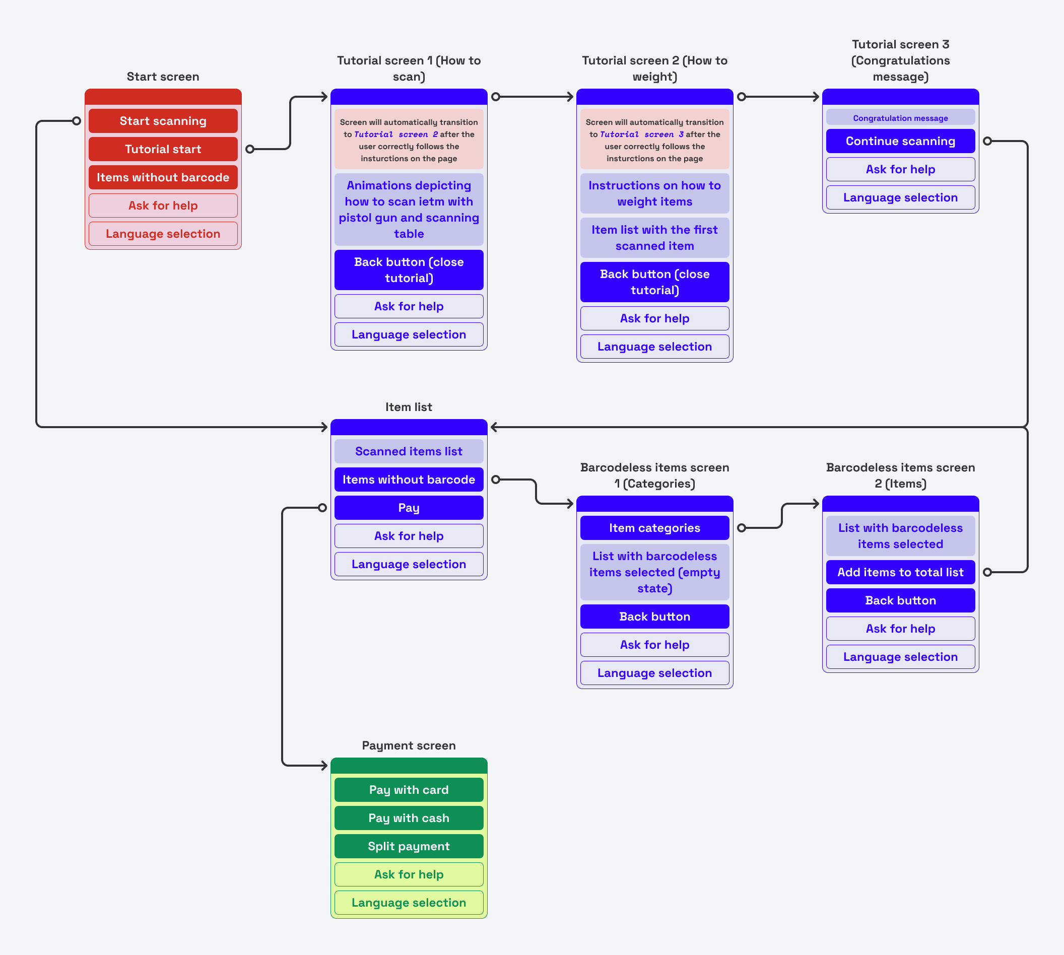
...
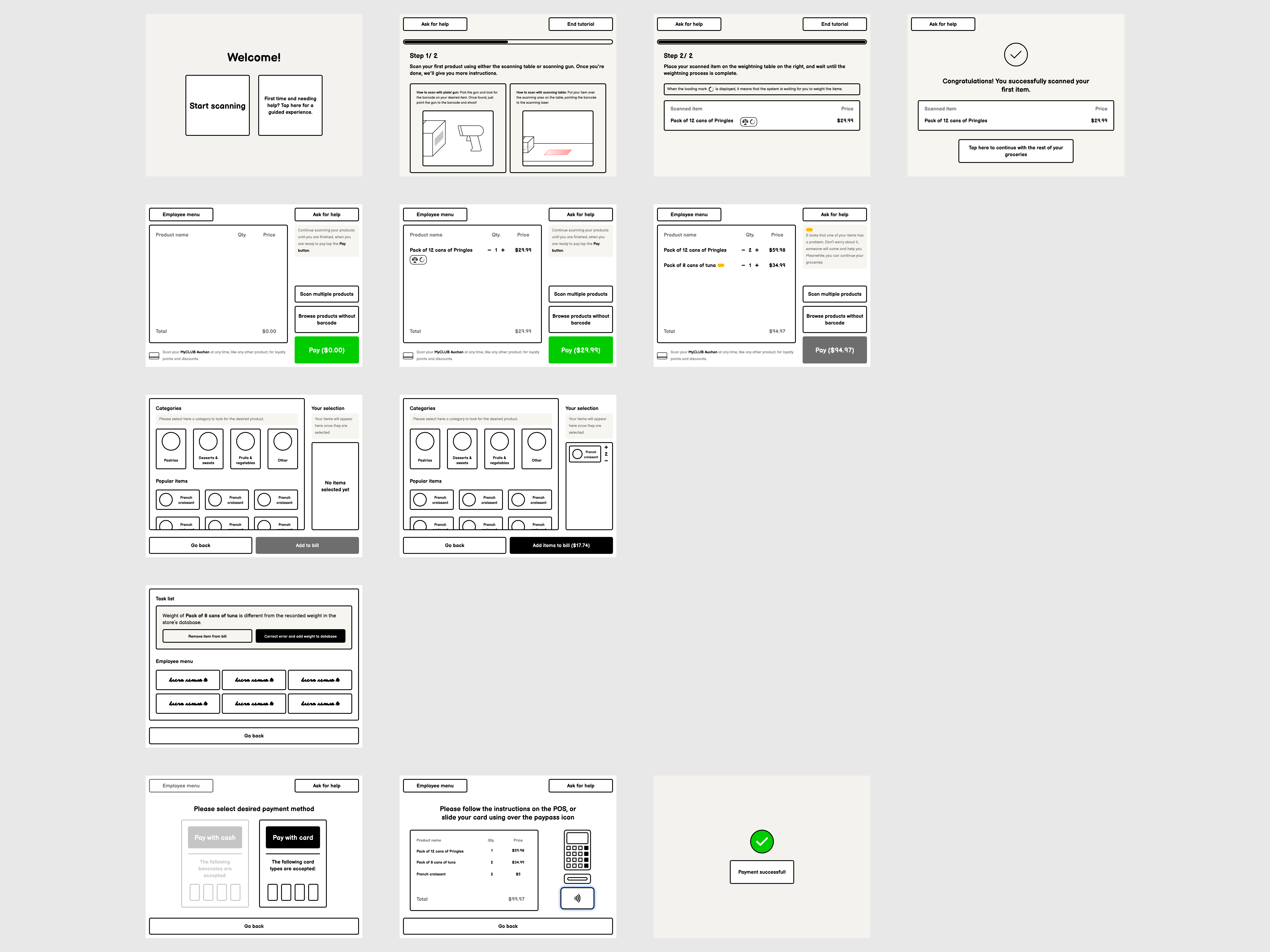
For this first test I explored the following solutions:
To obtain relevant results from the usability tests, I created a test environment of the actual flow. This simulated the ability to place scanned items on a scale. When interacting with the prototype, the users were able to scan items and simulate the weighting experience. This allowed me to test the solutions proposed to solve the error caused by the security scale.
You can play with the testing environment and experience the proposed solutions here:
For the first iteration, I recruited two participants for individual, one-on-one sessions. These two walkthrough sessions helped me understand the gaps in the redesigned flow. The insights were used to further iterate on the prototype.
Positive feedback
Participants appreciated that they could continue scanning items even if some of them presented errors. They also appreciated that they could add multiple items without a barcode at once, but suggested a bigger area for this step.
👍
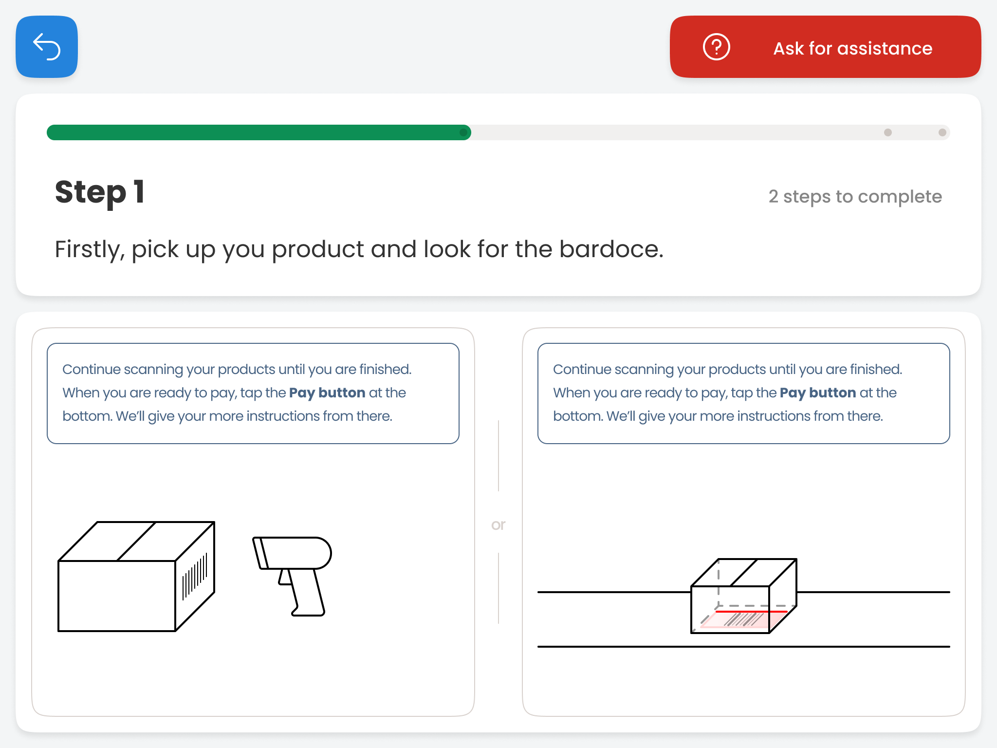
The main insight gathered from this round of testing was centered on the tutorial screen. The participants had problems understanding it, believing it was explanatory text.
👎
Participants believed that the Employee Menu button at the top of the screen is taking up too much space.
👎
In the second iteration, I addressed the gaps found in the first session. I took the final design decisions to solve the problems located in the second iteration.
The last iteration involved integrating both solutions and visual style. This resulted in a high-fidelity prototype.
In the store’s current flow, the screen freezes if an item does not have its recorded weight from the database. The screen displays a notification informing the customer that assistance is needed. The users we interviewed rendered this error and behavior as frustrating.
The most common scenario amongst customers was that when the self-checkout area is crowded, the personnel is very slow in delivering assistance. This leaves the customers waiting without the possibility to continue scanning their items. When assistance comes, they check the error and confirm that there is nothing wrong. Most of the time it is just a system problem.
The obvious solution, also suggested by some of the users, would be to remove the scale. An alternative solution is to keep the same functionality, but introduce a different and less frustrating experience.
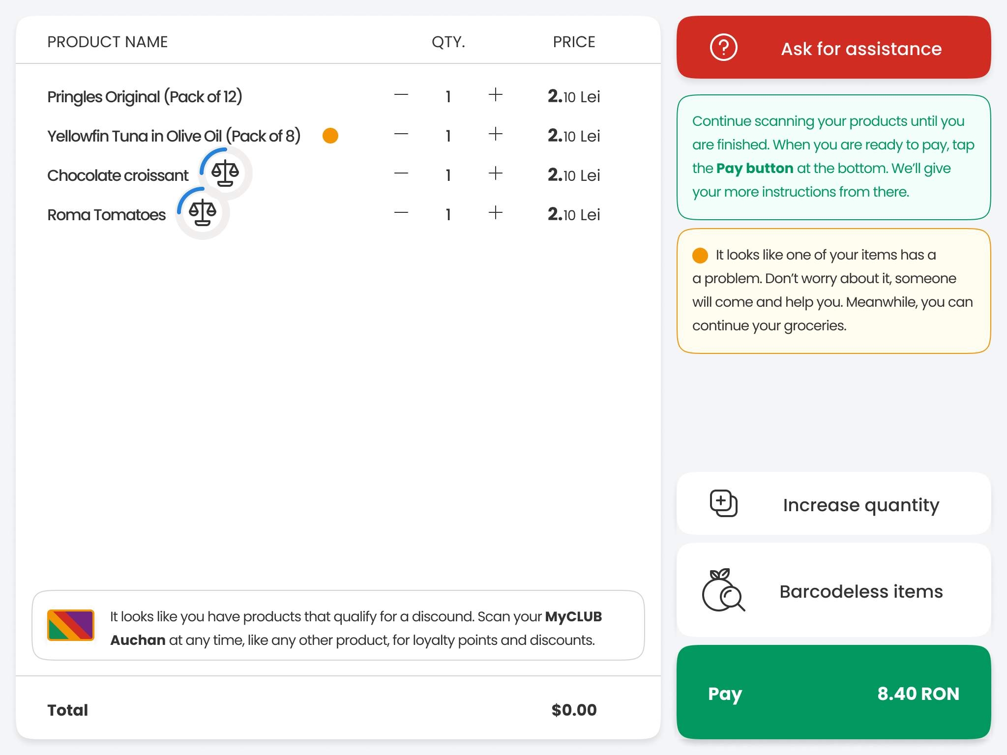
The proposed solution is to offer customers the ability to continue scanning their products even if an error occurs. The error would block the payment button. This ensures that users can’t leave without the problem being solved first. This way, the anti-theft measure will still exist. Customers won’t need to go through the frustration of waiting for assistance to come.
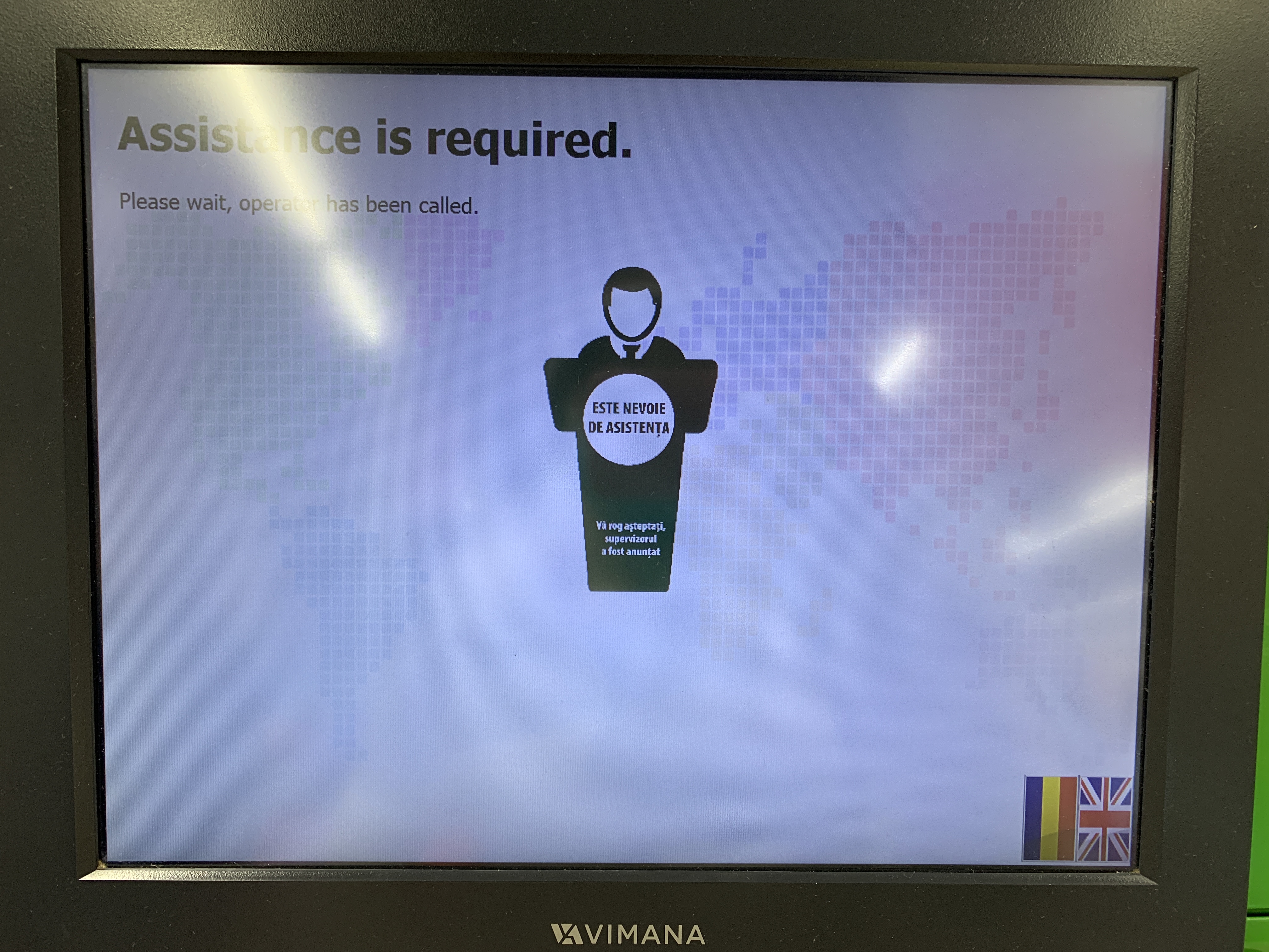
Screen in the current flow informing users that assistance is on the way

Behavior when an item’s weight is incorrect
While scanning, customers can accidentally introduce an item multiple time. They cannot undo the scanning process or eliminate a product. This is another anti-theft feature that frustrated the users we interviewed. The only way to remove an item is by calling for assistance. Similar to the problem described above, this can take a lot of time. The situation depends on the availability of the personnel.
The screen offers the possibility to press the Back button, but it will not erase the product from the item list. What the button will do is take the customers to the main list. The accidentally scanned item will notify the user that it needs to be put on the scale. This behavior creates a loop. The customer is informed that assistance is on the way while still being asked to weigh the article.
Increment buttons will help the customers remove the accidentally scanned item without assistance. Since this is also an anti-theft feature, this solution takes full advantage of the existing scale. Customers are not allowed to remove items to eliminate the risk of theft.
Every product needs to be put on the scale to confirm its weight. An item cannot be removed from the lists without the scale keeping track of this. A difference between the weight on the scale and the expected one based on the scanned items would display an error. This would block the payment button and call for assistance.

Screen in the current flow informing users that assistance is on the way

Increment buttons for easy removing or adding more items
A pop-up appears in the store’s current flow after the first scanned item. It asks the customers if they want to scan their MyCLUB Auchan discount card. The pop-up format created confusion amongst customers. They were unsure if once they refuse to scan the card, they will get another chance later in the check-out process.
The screen should give customers the ability to scan their products without interrupting their flow with this pop-up. While the check-out process is not interrupted, the screen would allow customers to scan the card at any given point.
There are two ways to solve this problem. One is by introducing a permanent tooltip at the bottom of the item list. It would offer the customer the opportunity to scan their card at any given moment. The second method is to introduce an item-dependent notification. The notification would only appear once customers scan a product that qualifies for a discount.
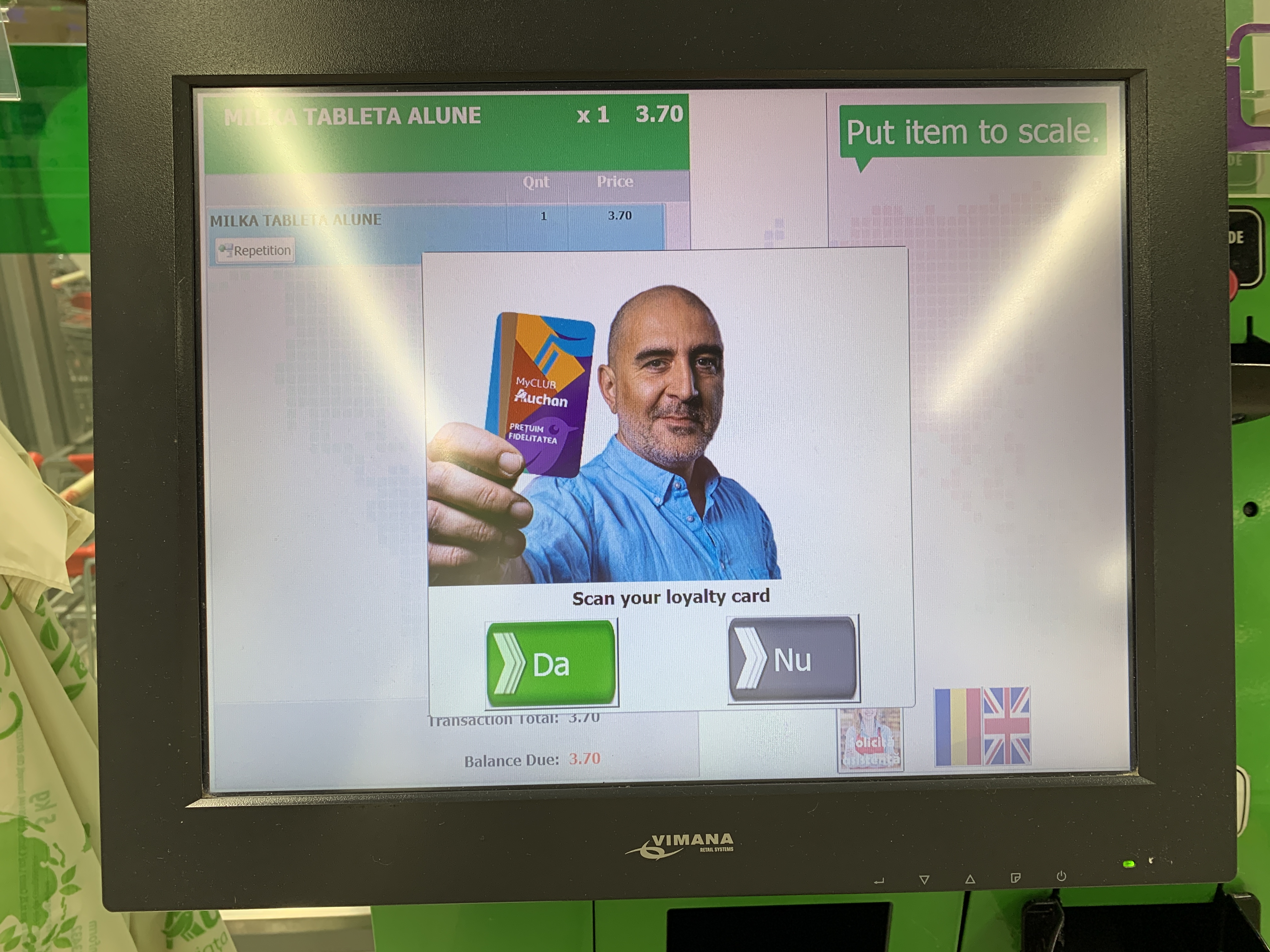
MyCLUB pop-up in the current flow
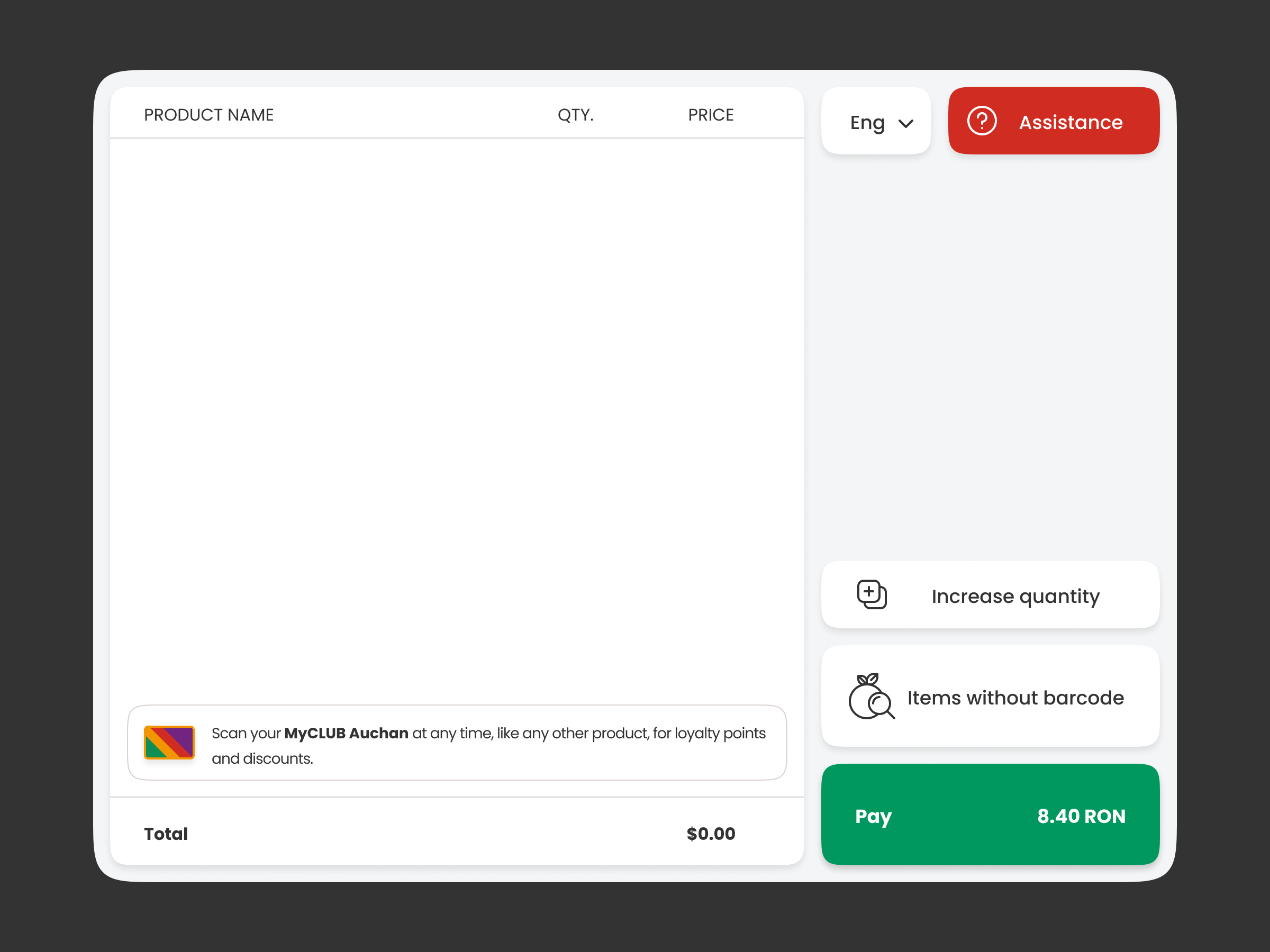
Tooltip informing users that they can scan their items at any given time
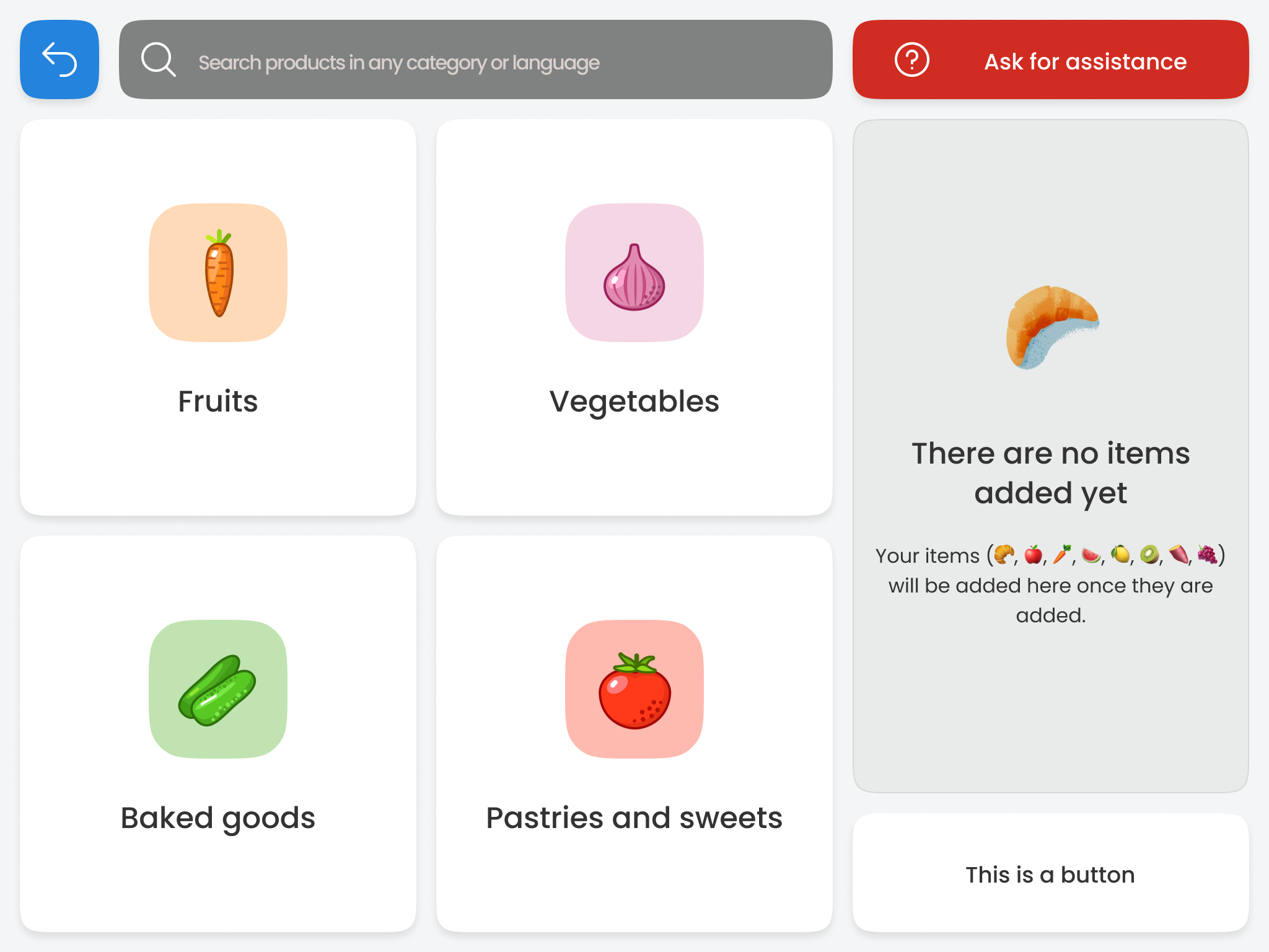
In the current flow, customers have to select the items without barcodes one by one. When customers have items from multiple categories, they need to open the selection menu for each of them. This process would less time by adding the possibility to select more than one item from the menu simultaneously.
The proposed feature here is adding a secondary item list inside this menu. This new list will allow customers to keep track of the items they added once they opened the selection menu. After selection, all the products will be added to the main check-out list.
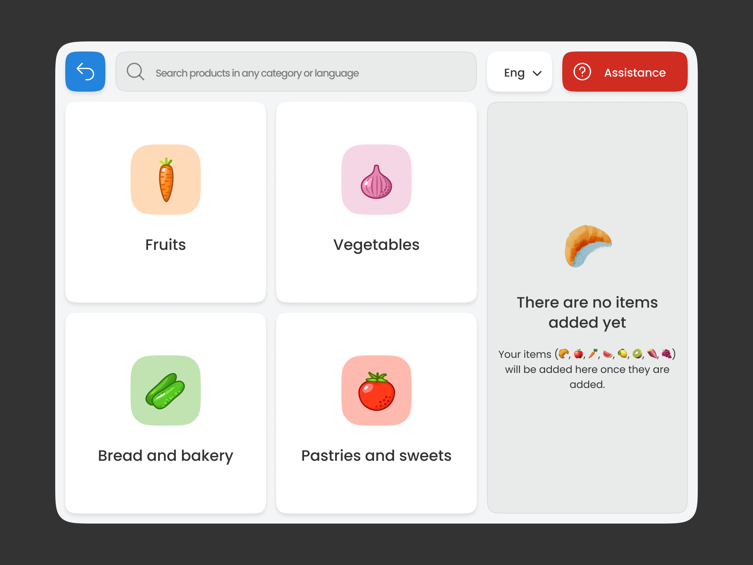
Items without barcode screen (category selection)
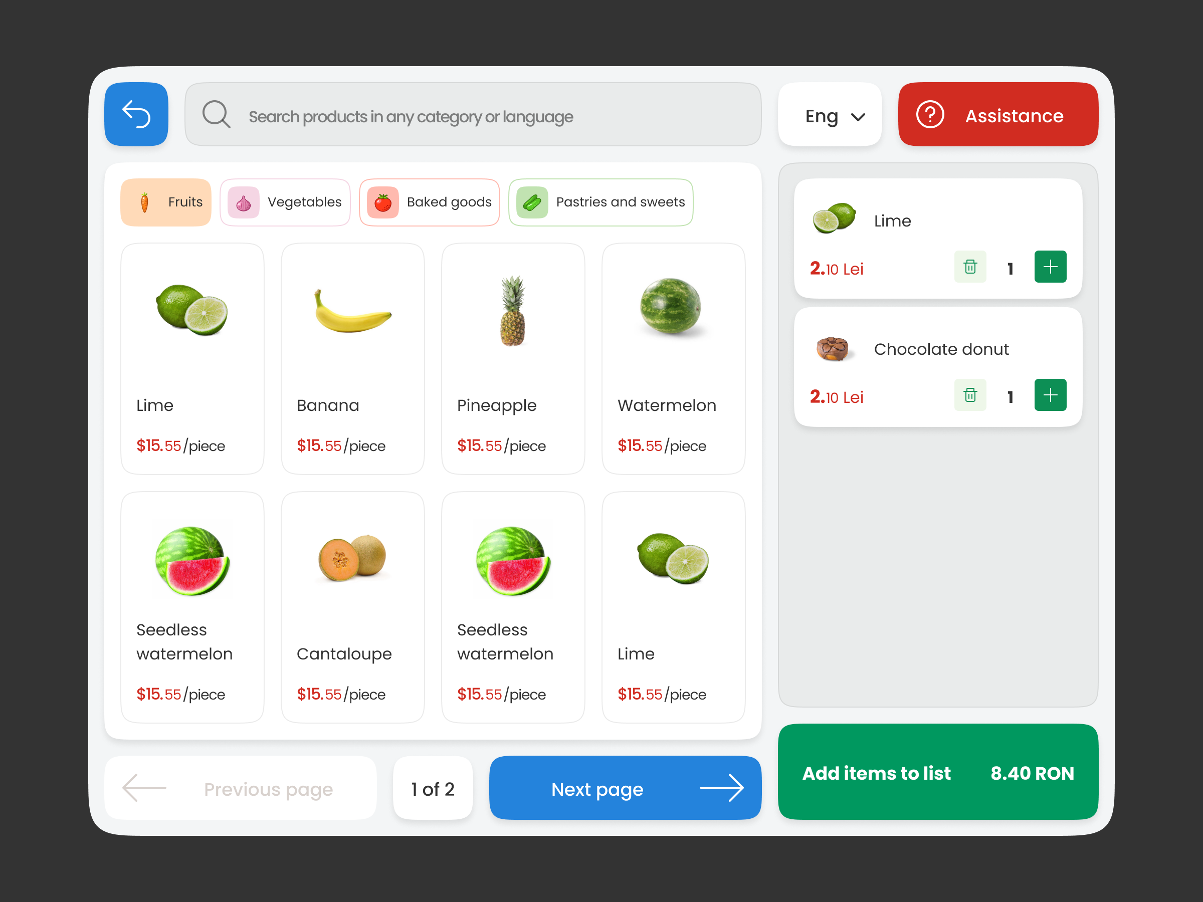
Items without barcode screen (items added)
